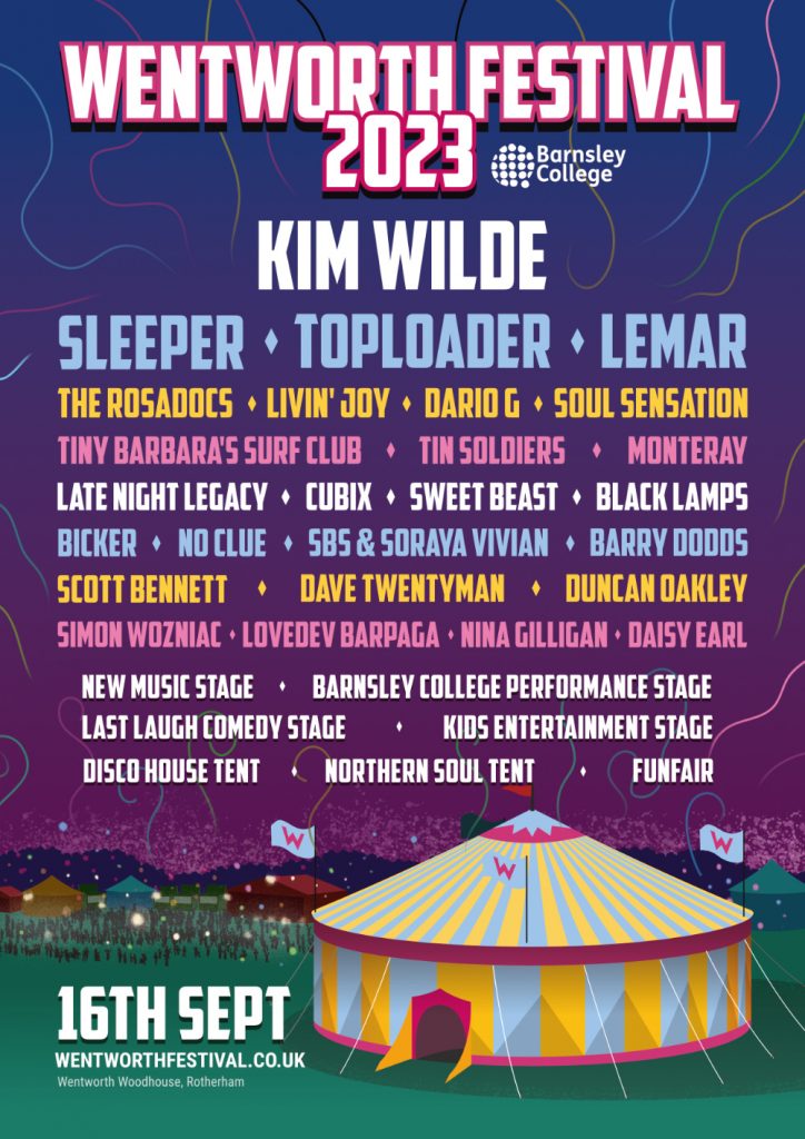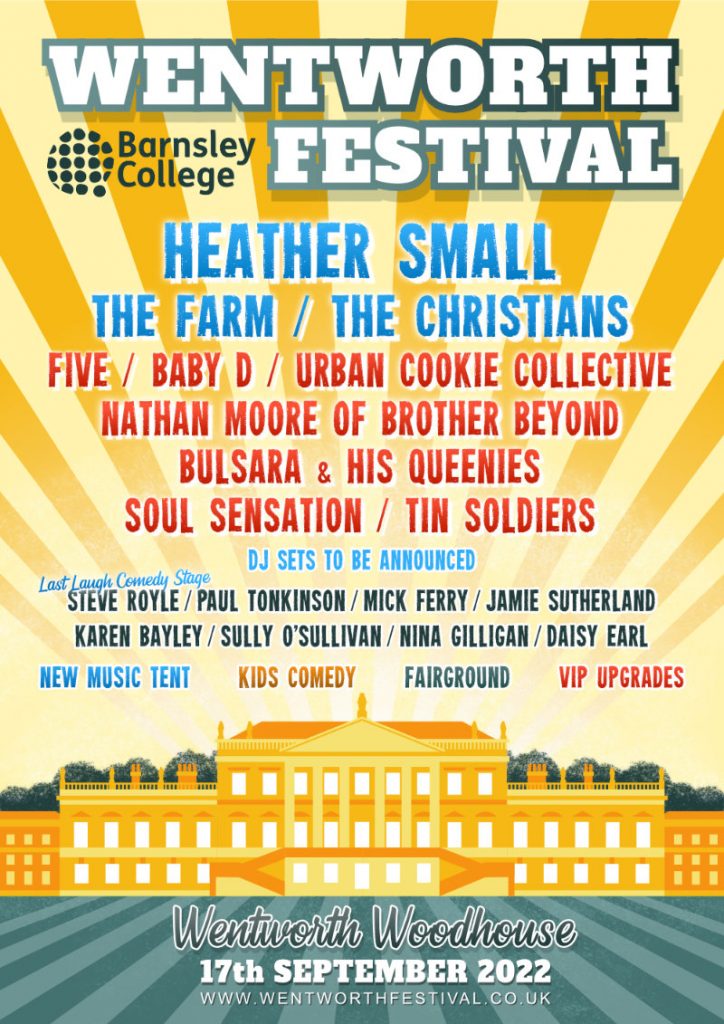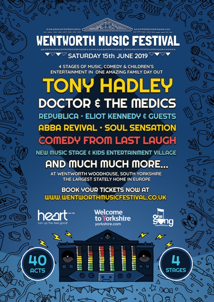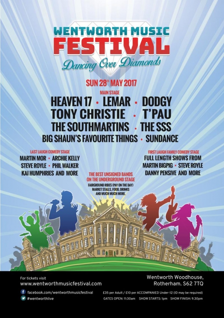


The choice of font and colours were a delicate process of finding something loud and energetic enough to capture the identity and vibrance of a music festival, while also being respectful of the venue. Chatting with the clients while knee-deep in organising big name bands , I put forward a big-splash illustration. Working up a detailed sketch of the venue would show it off with a lot more vibrancy than a photo alone could achieve. There was also a tight deadline and go-live date. Four bold colour silhouettes of non-specific singers and musicians meant the pre-publicity for the event could be while waiting for the confirmation of the big names to come. After sign off the graphics were reformatted for social media covers and the project was- quite literally - ready to rock!

With over 18 years of industry and design studio experience and a dedication to researching the latest design trends and web technology, it's not just about creating a look and feel , but solving design problems. JCU is more than just the final product, it's a design service.
Design is everywhere. John understands the DNA of great design communication and how to get you noticed. Rocket Steps has clients throughout the UK and overseas.