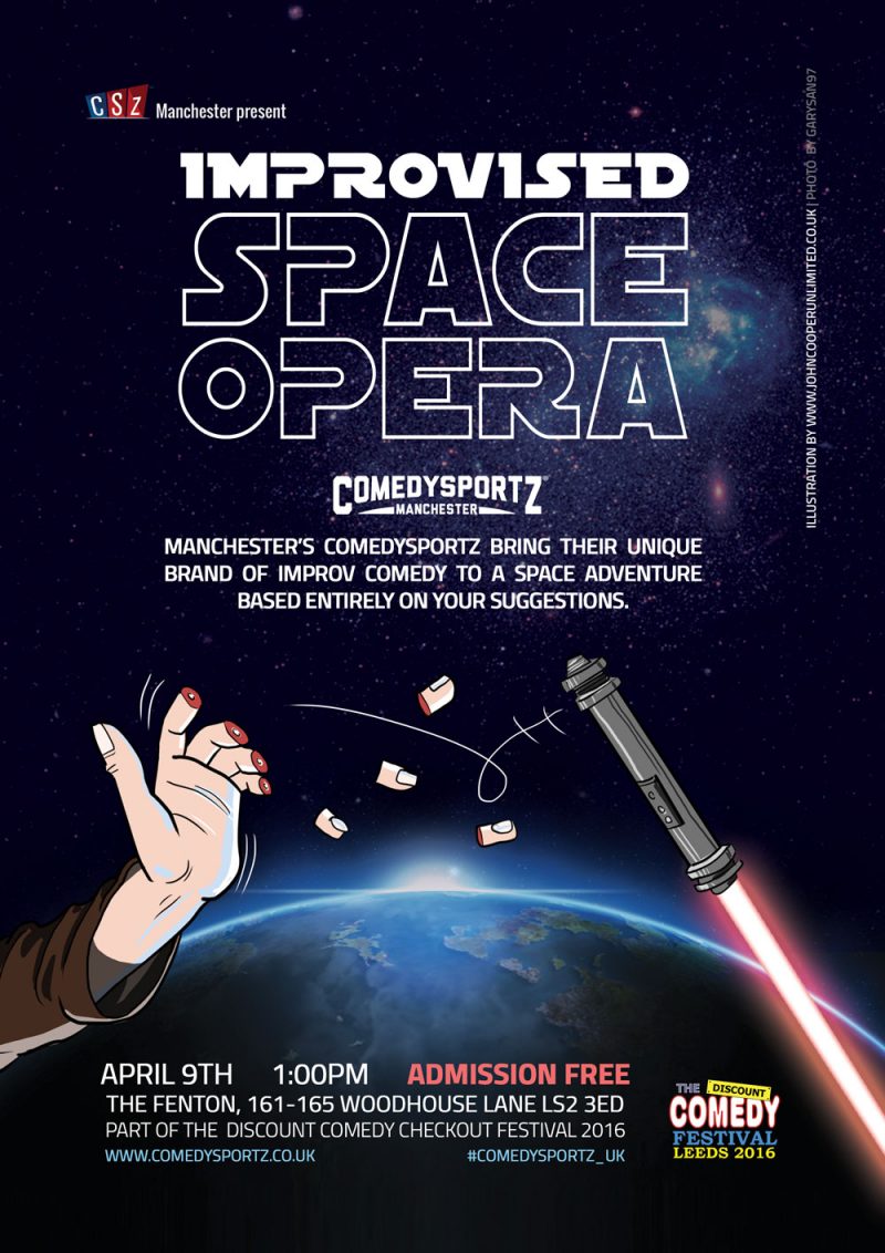
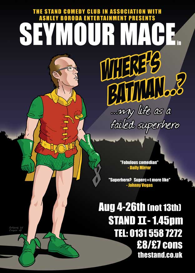
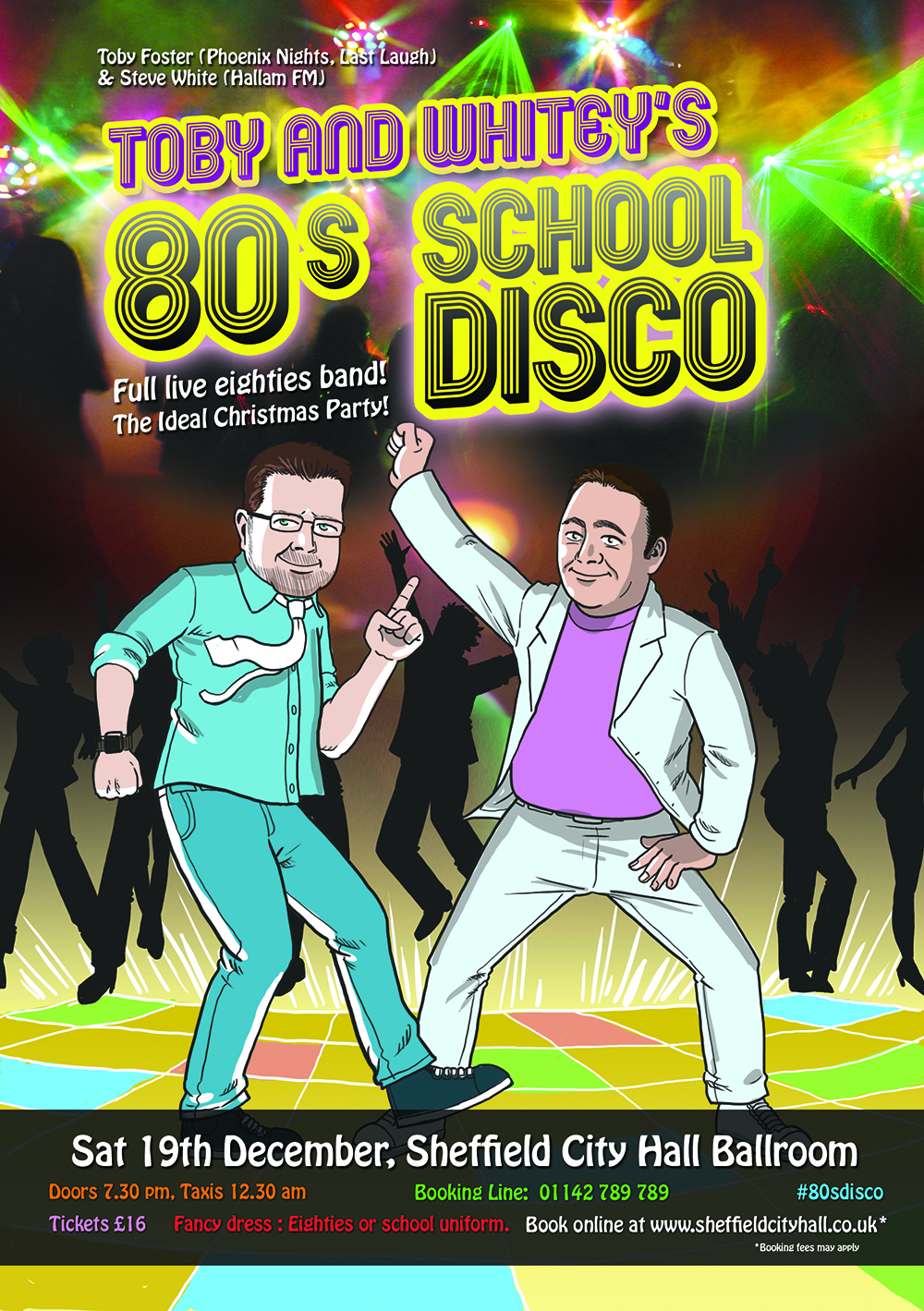
How about some illustration to really make your idea pop out? Edinburgh is a tough space to promote in at festival time (I should know), publicity needs to be super targeted so potential punters can see what you're about in the 2 seconds it takes to walk by your poster. Get in touch for a quote.


Good poster design captures attention, conveys a clear message, and leaves a lasting impression. This is important at festivals where competition is fierce. Effective posters balance striking visuals with concise, well-structured text, ensuring that the viewer understands the purpose at a glance. A strong focal point, whether an image, bold typography, or a compelling headline, draws the eye and establishes hierarchy. Colour choices should complement the theme while maintaining readability and contrast, ensuring that key information stands out.
Typography plays a crucial role; fonts should be legible from a distance and should work harmoniously with the design’s overall aesthetic. The layout must guide the viewer’s eye naturally, using spacing, alignment, and proportion to maintain clarity. White space, rather than being empty, helps prevent visual clutter and improves readability.
A successful poster maintains consistency in branding, whether for an event, product, or campaign, ensuring it aligns with the intended audience. High-quality images or illustrations enhance visual appeal, while simplicity keeps the message focused. Including a clear call to action, such as a website, date, or location, ensures the audience knows the next step. Ultimately, a well-designed poster is both visually engaging and functionally effective, striking a balance between creativity and communication.
Links: