"I’d long been an admirer of John Cooper’s artwork, so when I needed an illustrator for my first book, John was my first choice. His work was always inventive, and often greatly improved on my original ideas. He can work fast, to a deadline, and can adapt quickly to a change of plan. Working with him was a delightful experience."
Arthur Bostrom
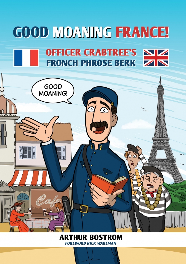
Arthur has a list of acting credits a mile long, but is probably best remembered as Crabtree from 'Allo 'Allo. The character's poor grasp of the French language was the source of many gags, as well as his introductory catchphrase 'Good Moaning' which also the title of the book, recapturing the style and humour of Crabtree's verbal mangling.
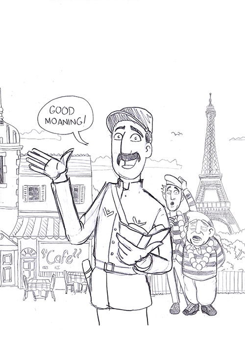
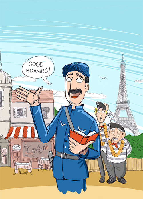
There was a long lead time on this project, permissions for usage and suchlike, which was an advantage for me as book illustrator, as it meant I had a bit time to think about the style and sketch ideas. Looking back at the early concept illustration now, my style, technique and tools have changed a lot. Even in a short space of time.
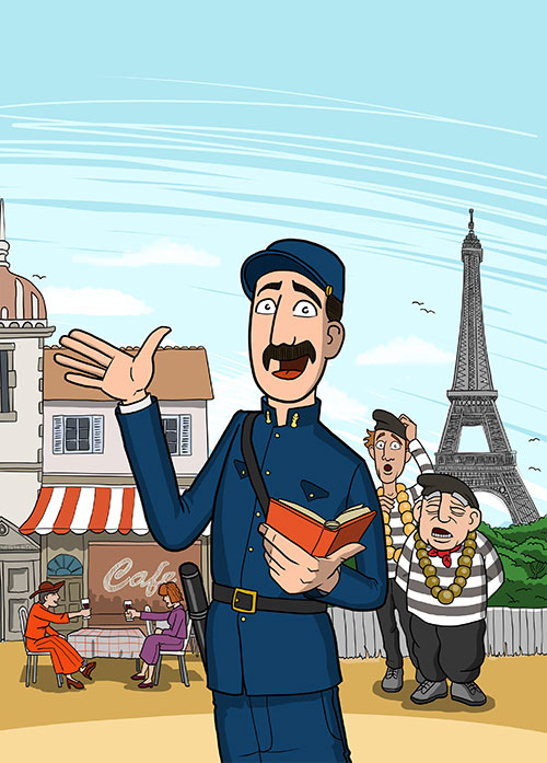
Arthur knew I could work in a few styles and wanted something a little more animated than the original concept sketches. I cast my ideas net wide, looking at the European ligne claire style popularised in the 50's and 60's by book illustrators like Herge, Bob de Moor and Joost Swarte. I’m a big fan of that illustration style and in context of the character and French origins of 'Allo 'Allo! it looked right. Also I was probably overthinking it.
The character of Crabtree really lends itself to this clean dynamic style, and in illustrated form I could easily see him rubbing shoulders with the Thompson and Thomson, or Agaton Sax.
Creating the cover was a good touchstone character reference for the other ten black and white illustrations which appear in the book. Details were referenced from photo stills, making sure the lapel buttons, badges and cloak all matched Crabtree's Gendarme costume as worn on screen.
The finished cover was realised first as a series of separate images. Handdrawn, scanned, then moved around on layers in clip studio to find the right composition, then digitally inked and coloured using a wacom intuos tablet. This technique is less time consuming that it looks, as it allows for experimentation in the composition. If the text title graphics overlap any elements, they can be shuffled around for clarity. Here's the cover composition:


You can order Arthur's book at the Waterside Press website, here.
See more illustration work here