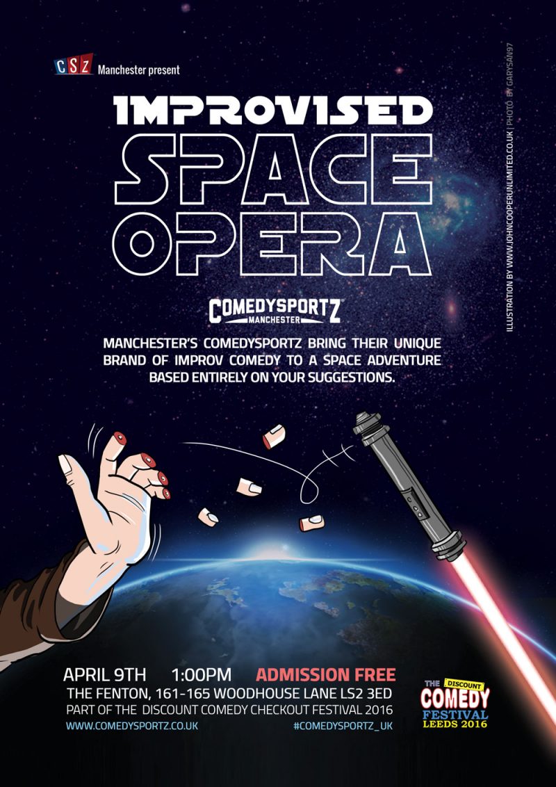
Over the last few months, I've collaborated with Prof Martin Fitgerald at the University of Bradford, creating illustrations for a card game titled' 'Capturing the Sun'.
Mock-up of box design
The game is designed to help with cognitive restructuring (a term used in CBT) and is aimed at people with long-term psychiatric conditions. Based on the Mouri folk tale of Maui, the Polynesian Demi-god who captures the sun with powerful ropes to make the day last longer. As described in the games manual;
"This game is designed to help people who experience serious mental illness to make their own powerful ropes so they can capture the skills, knowledge and understandings required for recovery, so they too, can live in the light."
It's been a fascinating project to work on as an illustrator, and I've always wanted to illustrate games.
Martin's a fan of monochrome linocut illustration and liked my work, so I leaned into that for these card game illustrations.
Deck cards depicted the terms used in cognitive restructuring, the challenge was then finding the right visual metaphor to describe the term. Some were straightforward, such as 'fortune telling' being depicted by a crystal ball.
Others needed more revisions to get right. We were exploring visual ideas that aren't too prescriptive - or lead to incorrectly interpreting the meaning. In the case of 'Generalizations', the concept sketch began as a fog cloud, which was fine but not very, then an image of different hats, labelled 'hats' to signify the general. This had the opposite effect, being visually interesting but a little confusing for the term it was trying to encapsulate. We settled on a signpost with vague directions like 'here' and 'there', which was a good balance of communication design.
The question cards needed faces. Heads of people from a diversity of backgrounds and ethnicities. As each card poses a dilemma, these folks expressions should be deep in thought, pondering their situation. In early drafts it was easy to push a little too far, drawing folks who looked very stressed out, so expressions were pulled back a little for a more subtle look. A raised eyebrow here or slight pout there was enough to capture what was needed without the character leaning into what could be perceived as negative.
The game also needed a box cover and logo. The logo was based on Mau the sun god and the general feel was simple, using the clarity and monochrome lino-cut aesthetic to give the game it's style. Here's a mock-up of the final cover design of the sun god.
Do you need illustration or graphic design for your next project or want creative input to help put your ideas in motion?
Early sketches, exploring ideas for the box and cards.
I've just completed work on the Childrens University of Manchester learning platform. As a freelance graphic designer, I was first brought in to work on these projects they were created in Flash around 12 years ago. Today, in what's now the final iteration of the website, all the content has been converted into either HTML5 or PDF. The goal has been to take the old, still valuable, learning content and convert it into a (hopefully) future-proof format, so it can live long and prosper.
Some of the original modules were designed by myself, and other older sections by other designers, with all content being created and written by students and staff at the university.
The HTMLs sections didn't need any attention and still work fine.
Making PDF's from old Flash files
The first task was 'harvesting' the original content from old flash files. For content I created I could go back to my source files. With designs not created by myself, I had to be a little more resourceful with only access to SWF files. With flash now deactivated on all web browsers, I used Adobe debugging tool to open the SWF's, and experimented with a few different ways to extract the graphics. From importing the SWFs into an old version of Flash to the rudimentary method of using a high res 2k monitor to screen grab and isolate elements, reduced them, clean up, and even re-traced back into vectors from pixels. This was time-consuming but also offered good results.
Harvesting the text was another challenge. In some cases I got lucky and text from the flash file was being loaded externally from an XML file. The worst case was screen-grabbing text and running it through an OCR program (optical character recognition). This converted graphics into text which then needed proofing to check for things like letter 'o's not showing up as zeros. Again time-consuming but worthwhile.
Once all the content was gathered the new design work could begin. Creating layouts and new graphics where needed to glue together the continuity, or make clear elements that were previously motion graphics.
I was given the flexibility to come up with some new cover images. It's been a bit like being a design archaeologist, unearthing the past. The staff at the university were really pleased with the results and I'd like to think if you came to the website fresh today, You'd just see the learning content, which I hope will be evergreen.
John is a freelance graphic designer based in Manchester with clients around the world. If you have a project or need design advice, contact him here;
Edinburgh Festival Poster Design
Heading off to the Edinburgh festival this year? Need festival posters designing? Flyers and a social media pack for all your online stuff? I've got you covered.
How about some illustration to really make your idea pop out? Edinburgh is a tough space to promote in at festival time (I should know), publicity needs to be super targeted so potential punters can see what you're about in the 2 seconds it takes to walk by your poster. Get in touch for a quote.
Toby Foster's DiscoPoster illustration designComedy at the KingsBranding and logo design - Wentworth Music Festival
Good poster design captures attention, conveys a clear message, and leaves a lasting impression. This is important at festivals where competition is fierce. Effective posters balance striking visuals with concise, well-structured text, ensuring that the viewer understands the purpose at a glance. A strong focal point, whether an image, bold typography, or a compelling headline, draws the eye and establishes hierarchy. Colour choices should complement the theme while maintaining readability and contrast, ensuring that key information stands out.
Typography plays a crucial role; fonts should be legible from a distance and should work harmoniously with the design’s overall aesthetic. The layout must guide the viewer’s eye naturally, using spacing, alignment, and proportion to maintain clarity. White space, rather than being empty, helps prevent visual clutter and improves readability.
A successful poster maintains consistency in branding, whether for an event, product, or campaign, ensuring it aligns with the intended audience. High-quality images or illustrations enhance visual appeal, while simplicity keeps the message focused. Including a clear call to action, such as a website, date, or location, ensures the audience knows the next step. Ultimately, a well-designed poster is both visually engaging and functionally effective, striking a balance between creativity and communication.
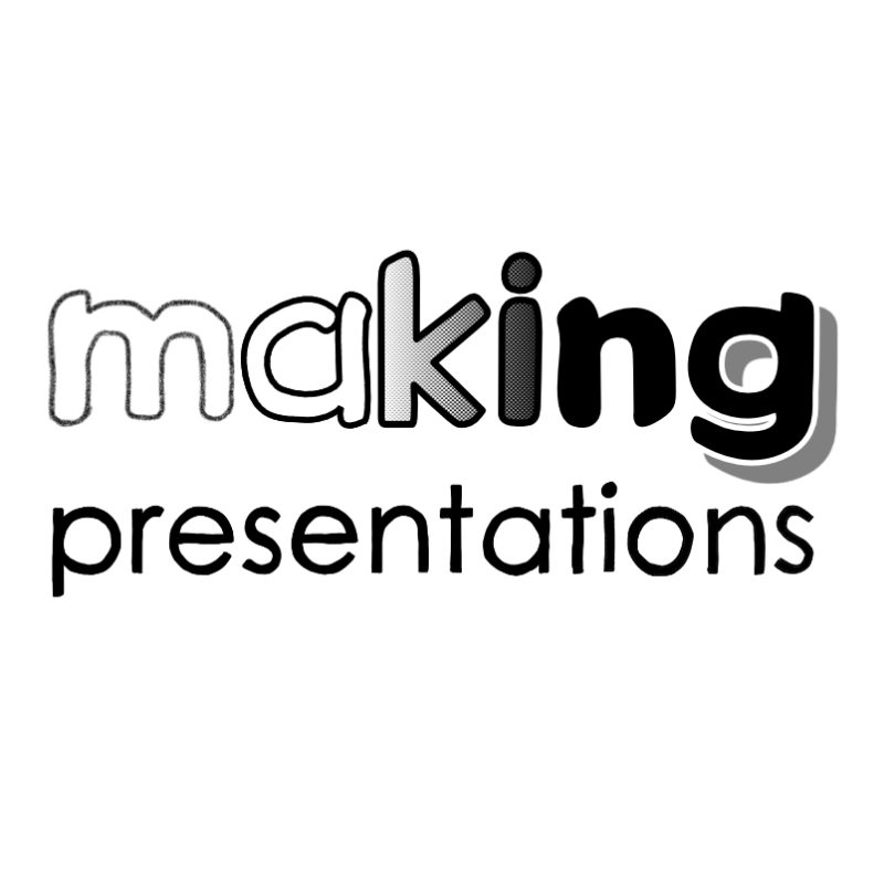
Making Presentations is a training company that specialises in presenting skills, online and face to face.
The design work, logo, icons and deck slides are all bespoke. This is communication design, where the artwork has a very specific job to. The icons are more detailed illustrations, to keep online attendees engaged longer. The series of deck slides also are illustrations, in a simple neutral style to connect with as broad a demographic as possible and guide the attendees through their training journey.
Making Presentations founder Richard Pascoe put a lot of thought into what he needed for his artwork slide deck, and it shows.
Isometric graphic design
Isometric design is a form of 3D drawing that's ideal for maps and infographics. The location in this example is Wasing Park in Berkshire. The event theme was 'enchanted forest', so the fantastical elements are placed around the outside, to keep the informative elements clear.
'Full-service design' covers everything you need for a marketing campaign. From logo, branding and website, to social media, graphics, illustration and print - everything. It's a bit broad and not always a great description, as clients can differ.
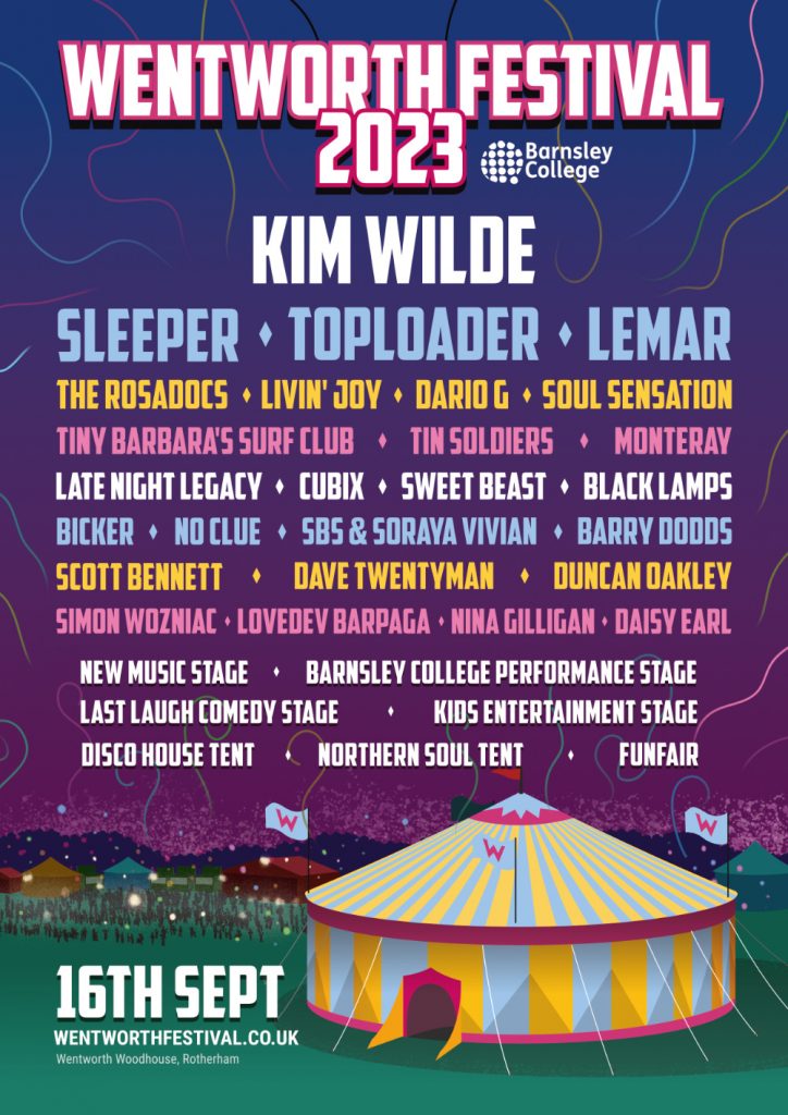
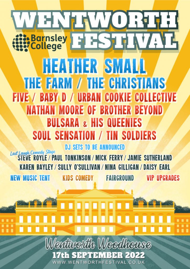
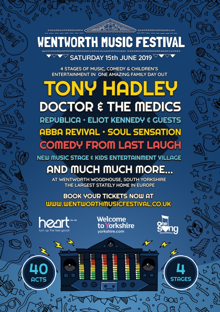
Wentfest, formerly Wentworth Festival has built its brand since 2017 and each year's look is fresh and vibrant while being consistent across print and web, so it always looks professional. As with all the work I do, nothing is outsourced.
A logo, a poster and a quick-loading responsive website that sells tickets, for a new music festival. I love it when I get a project that covers all design disciplines for great cross branding experience.
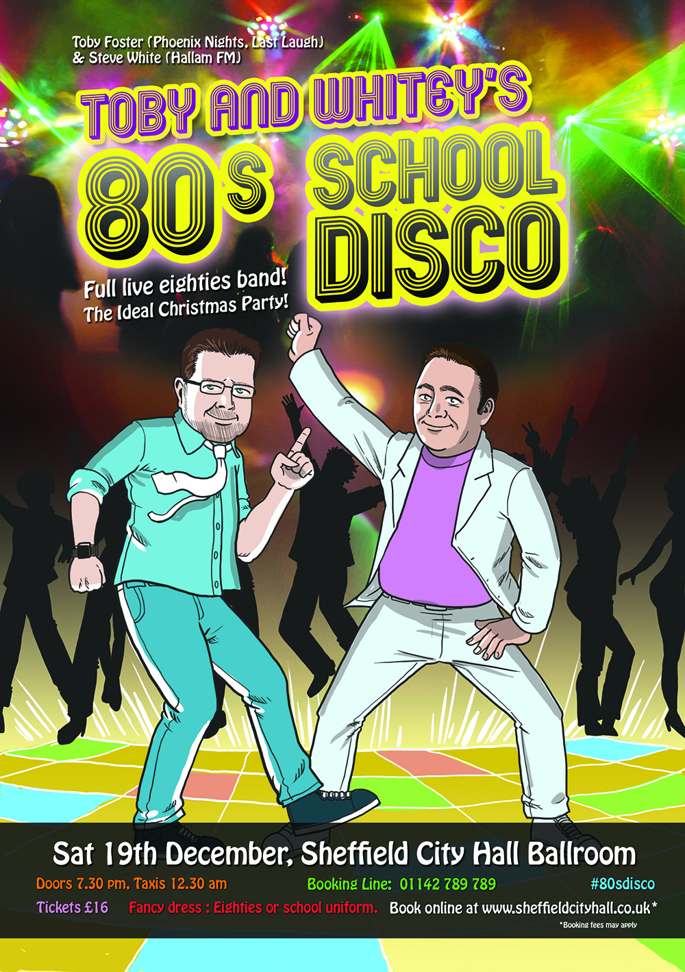
One such recent project was Wentworth Music Festival. Working with a client I've had for many years they said 'this is what we want, and this is the deadline. It needed to be bright and punchy, but also put on show the spectacular venue itself, Wentworth Woodhouse. A large privately owned stately home outside of Rotherham.
2017
The choice of font and colours were a delicate process of finding something loud and energetic enough to capture the identity and vibrance of a music festival, while also being respectful of the venue. Chatting with the clients while knee-deep in organising big name bands , I put forward a big-splash illustration. Working up a detailed sketch of the venue would show it off with a lot more vibrancy than a photo alone could achieve. There was also a tight deadline and go-live date. Four bold colour silhouettes of non-specific singers and musicians meant the pre-publicity for the event could be while waiting for the confirmation of the big names to come. After sign off the graphics were reformatted for social media covers and the project was- quite literally - ready to rock!
With over 18 years of industry and design studio experience and a dedication to researching the latest design trends and web technology, it's not just about creating a look and feel , but solving design problems. JCU is more than just the final product, it's a design service.
Design is everywhere. John understands the DNA of great design communication and how to get you noticed. Rocket Steps has clients throughout the UK and overseas.
Flat style graphic design
Contact: hey@johncooperdesign.co.uk
Brochure Illustration for Manchester City Council
Before I started drawing and illustration, my older brother Peter would draw comic strips. In some ways he did a lot of things I got interested in, apart from football. Through the years the idea of collaborating had never really crossed my mind, until a few month ago when he suggested it, so it was a great opportunity to combine our skills.
Peter is a creative person and a problem solver. He has a cartoony style to his drawing, and doesn't get to draw as much as I do as his real role is working as a commissioning manager at Manchester City Council, in the Directorate for Public Health.
Last year he drew a series of images for a project highlighting 'the first 1000 days of a child's life'. Focusing on a young couple having a child, it tells their story in relation to the services provided by Health and Social Care providers in Manchester, so anyone in that position can find out about the support they can get - in a way that is visual and engaging.
When it was decided to turn this into the Director of Public Health’s annual report, I was approached to convert the original black and white hand-drawn artwork into digitally coloured PDF. I also supplied architectural and background for the cover and double spread.
The original artwork required photographing, additional artwork was done digitally with a combination of wacom tablet and clip studio pro, a package that specialises in creating comic book style illustration.
I was initially a bit worried about some of the conversion process, as some of the original artwork was very big A2 in size. Reducing down would loose some of the detail. Fortunately the chunky line work (Peter's signature style) was perfect and the images could be reduced well, and made the colouring process a breeze.
It was a great opportunity to finally collaborate on something together, and the feedback from children’s health and social care professionals has been incredibly positive. You can download the PDF report here.
You can see more of my illustration commission work on this site, or if you're thinking about a commission email me at john@rocketsteps.co.uk
Branding the Kings Arms, Salford
Back in 2018, I did the logo and rebranding on the Kings Arms Theatre pub in Salford, but I never did a blog, so here it is.
As a regular there they knew me well as my graphic design work for other productions had already graced their walls. When it came to their rebrand, they just had to ask.
Rebranding of the King.
The venue is pretty unique, being a great real ale pub, and also a theatre. Many times I've sat in the bar, watching it fill up in seconds as the sold-out show upstairs has its halftime break. It's a grand old place bursting with fresh new talent (The sitcom Fresh Meat was filmed there).
Above the bar is a stained glass window of a king. Not sure which one, but it was a starting point. For the rebrand, I took what was already there and gave it a bit of modern pop.
I got a lot of great feedback from Lisa, who commissioned the work and suggested the tattoos of local legends.
Using the same forms from the window; beard, robes and crown I created sketches, simplifying the stained glass into line art and turning the king to face and embrace his subjects. A new king with a broad smile who likes to put on a performance. (in my mind he sounds like Brian Blessed!).
Since the rebranding, the pub has launched its own ale, the Queen's Legs. Does the queen have hairy legs or is it the King in drag? I'm afraid even I can't reveal that.
Recent design work for the Kings Arms Salford.
Performer Publicity
Poster and flyer design for performers and theatre productions.
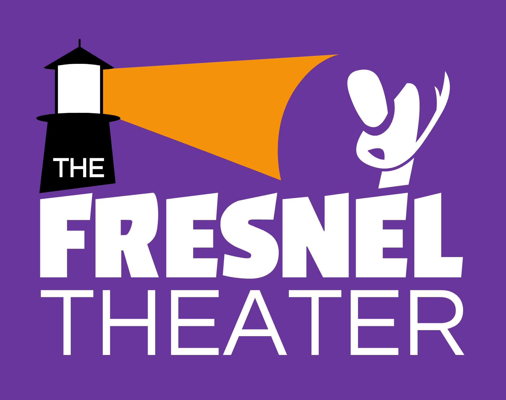
Branding Design - Fresnel Theater (USA)
A brand design is more than just a logo. It's a representation of what the product or service is – what it stand for. With a good brand should tell you what what it's selling at a glance. A good brand tells a story.
Matt and Krista were looking for a designer for their new community theater space, the Fresnel Theater, opening in Portland, Maine. I met Matt through Comedysportz, a comedy improv show.
He’s a really enthusiastic smart guy, and it came as no surprise that he already had a mission statement, which is a great starting point for a designer.
It answered the questions that I'd initially ask - designer to client. What are the goals of the business, what makes your company different? Descriptive words. So that I can read and listen to the language they use and tune into their frequency and start creating visuals
Branding design - The Fresnel Theater (USA)
So in designing the logo it was important to look for something that was welcoming and incorporated The keywords of playfulness community and compassion.
From a practical point of view It needed to be bright and chunky so that when transferred into signage on the building, it's seen clearly from a distance.
Matt was keen for the logo to reflect the lighthouses that portland is known for. The name fresnal comes from bevels in the lens of a lighthouse main lamp that helps focus the beam. As a designer, I love that kind of creative thinking.
Once the colours and typeface were finalised I created and branding guide. This is a reference document for printers. Most large commercial brands have very detailed branding guides, but really every business should have something like this. It’s helpful to printers and is a reliable way to future proof the consistency of your brand over time.
Here’s the final logo that Matt and Krista approved.
Autumn design illustration update
Time for an update of my design illustration portfolio. Here are some of the projects I've been working on in the last few months. From logo illustrations to hand drawn artwork and a corporate live event project.
It was a joy to work again on Wentworth music festival redesigning the logo, look and feel of the festival.
Designing a logo for a metal band was a bit of a challenge and I had to dig deep into the right references to get the Look and feel right for Black Sheets of Rain.
The life drawing event was a very exciting challenge to work with a group of Managers from a well-known comp and develop a advertising poster based on their suggestions in a very short space of time I was quite proud with the result and hope they were too.
Hand drawn wedding invitation
Digital poster illustration
Logo design for Blue Baboon
Branding and logo design - Wentworth Music Festival
logo design - Black Sheets of Rain
JCU Design Studio work with people in businesses of all sizes in all sectors. Providing them with websites they can be proud of, design ideas that gets attention andillustrations that are as unique as they are. Good design aids good business, providing the confidence to present a public image with integrity and verve, and also win new customers. It’s my passion to engage people with good design across all media, whether setting up a website that can be easily updated, providing an illustration commission, animation or a cross branded print campaign with online marketing and SEO. JCU is more than just the final product, it’s a design service.
Design illustration, logo design
By continuing to browse this site, you agree to it's use of cookies